
What Are Data Visualization Examples?
A Simple Definition of Data Visualization
Data visualization is the process of turning numbers and raw data into visual stories. Charts, graphs, and diagrams help you make sense of complex data quickly. For example, instead of reading a table with hundreds of numbers, you can look at a simple bar chart and understand trends right away. These visuals speak a universal language that everyone can grasp.
Why Are Examples Important for Understanding Visualizations?
Examples give context. Without them, terms like "scatter plot" or "heatmap" may sound confusing. But when you see an example of a company tracking competitor pricing through a line graph, it clicks. Examples show how data becomes useful in real life. They turn theory into practice. That’s why we’re diving deep into real-world data visualization examples.
Why Data Visualization Matters in Competitor Analysis
The Role of Visuals in Business Strategy
When you're analyzing competitors, you’re collecting tons of data: prices, features, customer reviews, marketing strategies. But what do you do with all that information? That’s where data visualization examples come in. Visuals help you organize and understand it.
Let’s say your competitor just launched a new pricing tier. You could build a table to track how their prices change over time—you don’t just see numbers—you see strategy.
From Raw Data to Insights: Telling the Competitive Story
Imagine you're comparing five products in your space. A basic spreadsheet won't show you how they stack up in features or user sentiment. But what if you had a radar chart that displays all five at once? Now, you can immediately spot who leads in features or who’s lagging in customer satisfaction. These are powerful insights made simple with the right data visualization examples.
Common Challenges Without Visual Representations
If you skip data visualization examples, you face a few key problems:
- Information overload: Too much data without structure.
- Slower decision-making: It’s harder to spot trends in raw numbers.
- Miscommunication: Stakeholders may not interpret data the same way.
That’s why tools are game-changers. They take complex input and turn it into clean, shareable visuals. You and your team stay aligned.
Common Types of Data Visualization Examples and Their Use Cases
Bar Charts, Line Graphs, and Pie Charts
These are the classics. You’ve seen them in school and in business reports. They’re also some of the most common data visualization examples. Here’s how you can use them:
- Bar Charts: Compare different competitors’ product pricing.
- Line Graphs: Track how one competitor’s social media engagement changes over time.
- Pie Charts: Show market share across the top five companies.
Heatmaps, Scatter Plots, and Radar Charts
Want to go deeper? These advanced data visualization examples offer powerful insights:
- Heatmaps: Visualize customer reviews by sentiment and frequency.
- Scatter Plots: Compare marketing spend to sales performance.
- Radar Charts: Great for comparing feature sets between products.
Real-World Scenarios: When to Use Each Type
Imagine your company is launching a new app. You want to compare it to three existing apps. These data visualization examples can help:
- Use a radar chart to show feature gaps.
- Create a scatter plot to compare download rates to user ratings.
- Add a heatmap for UX complaints in user reviews.
With VisualGPT’s AI visual features, you can create all these visuals in just a few clicks.
Example: How Product Teams Compare Feature Sets Visually
Let’s say you’re building a task management tool. You list out features like file sharing, tagging, offline access, and real-time sync. You collect competitor data and use VisualGPT to generate one of the best data visualization examples — a radar chart. The result? A visual map of which features your product leads in—and where you fall behind. This gives clear direction for roadmap decisions.
Top 10 Data Visualization Examples for Competitor Research
Data visualization transforms raw competitor data into actionable insights, helping businesses make strategic decisions. Below, we explore 10 essential data visualization examples used by product, marketing, and sales teams to analyze competitors effectively.
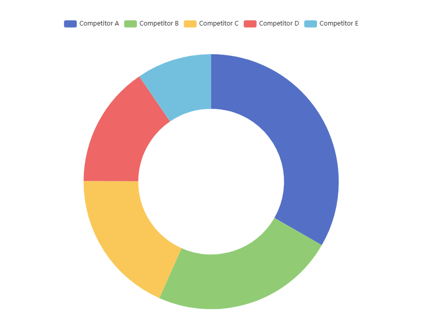
1. Market Share Pie Chart - Breaks down the market distribution among key competitors. Key Elements:
- Competitor names & their respective market shares (%)
- Color-coded segments for clarity
- Optional interactive hover effects for deeper insights
Best Use Cases:
- Identifying industry leaders vs. niche players
- Tracking shifts in market dominance over time
Example: A SaaS company uses a pie chart to compare its 15% market share against competitors (e.g., Competitor A: 40%, Competitor B: 30%).
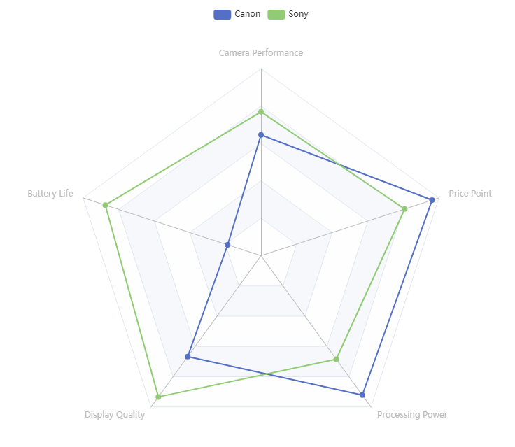
2. Feature Comparison Radar Chart - Visualizes how competing products stack up across multiple features. Key Elements:
- Axes representing different product features (e.g., speed, UX, integrations)
- Overlapping shapes to compare competitors’ strengths/weaknesses
Best Use Cases:
- Product benchmarking
- Identifying gaps in your own offerings
Example: A smartphone brand plots camera quality, battery life, and price against rivals to find competitive advantages.
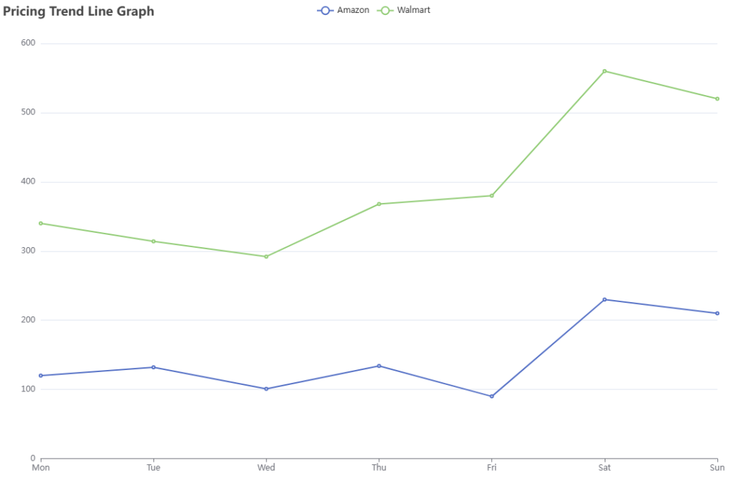
3. Pricing Trend Line Graph - Tracks how competitors adjust pricing over weeks, months, or years. Key Elements:
- Time (X-axis) vs. Price (Y-axis)
- Multiple lines for different competitors
Best Use Cases:
- Dynamic pricing strategies
- Seasonal discount analysis
Example: An e-commerce brand monitors Amazon and Walmart’s price fluctuations to optimize promotions.
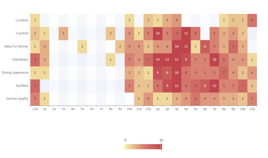
4. Customer Sentiment Heatmap - Aggregates customer reviews to highlight strengths and pain points. Key Elements:
- Color intensity (red = negative, green = positive)
- Categories like "customer support," "ease of use," "pricing"
Best Use Cases:
- Identifying common complaints about competitors
- Improving your own product based on feedback trends
Example: A hotel chain analyzes Tripadvisor ratings to see why a rival brand scores higher in "cleanliness."
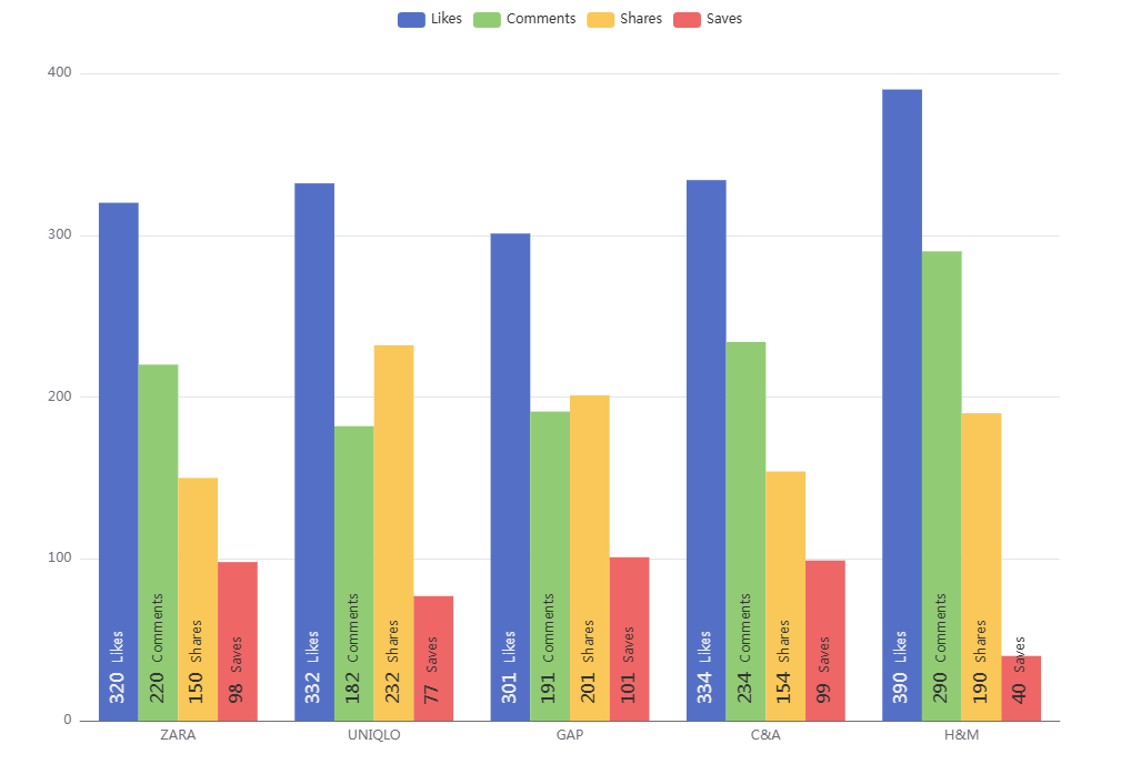
5. Social Engagement Bar Chart - Compares competitors’ performance on social platforms (likes, shares, comments). Key Elements:
- Competitors on X-axis, engagement metrics on Y-axis
- Stacked bars for different platforms (Facebook, Instagram, LinkedIn)
Best Use Cases:
- Measuring brand awareness
- Benchmarking content strategy
Example: A fashion brand compares its Instagram engagement against Zara and H&M.
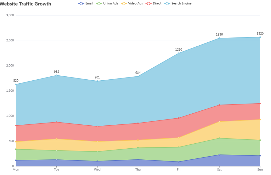
6. Website Traffic Growth Line Graph - Tracks organic and paid traffic trends over time. Key Elements:
- Monthly/quarterly traffic data
- Separate lines for different competitors
Best Use Cases:
- Evaluating SEO performance
- Gauging the impact of competitors’ marketing campaigns
Example: A tech blog monitors its traffic growth vs. competitors like TechCrunch and Wired.
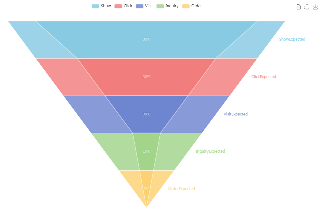
7. Conversion Funnel Chart - Breaks down how competitors turn visitors into customers. Key Elements:
- Stages like "Landing Page Views" → "Sign-ups" → "Purchases"
- Drop-off rates at each stage
Best Use Cases:
- Identifying leaks in competitors’ funnels
- Optimizing your own conversion paths
Example: An e-learning platform compares its checkout abandonment rate against Udemy’s.
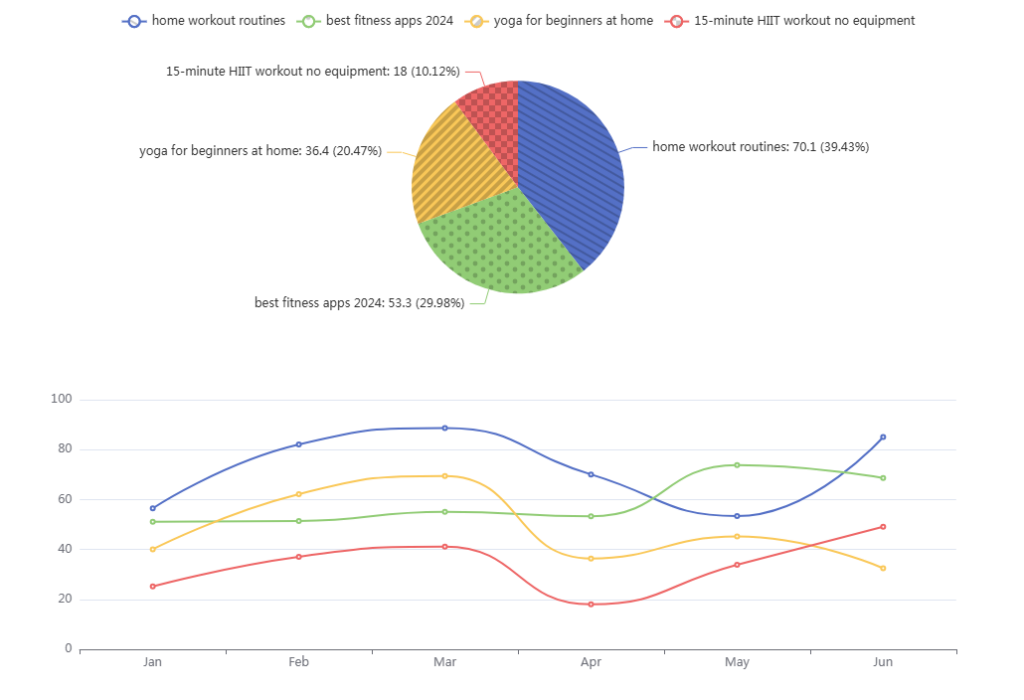
8. Keyword Volume Pie Chart - Reveals which keywords competitors prioritize in SEO. Key Elements:
- Top-ranking keywords by search volume
- Percentage distribution of keyword focus
Best Use Cases:
- Discovering untapped SEO opportunities
- Adjusting content strategy based on competitors’ keyword gaps
Example: A fitness app finds that a rival ranks for "home workouts" but misses "yoga for beginners."
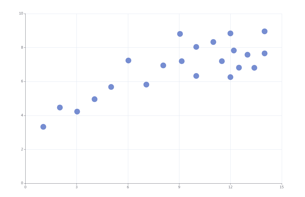
9. Ad Spend vs. ROI Scatter Plot - Evaluates which competitors get the best returns on ad investments. Key Elements:
- X-axis = Ad spend, Y-axis = Revenue/Conversions
- Competitors plotted as dots with performance trends
Best Use Cases:
- Optimizing ad budget allocation
- Reverse-engineering high-performing campaigns
Example: A DTC brand analyzes Facebook Ad Library data to see which competitor gets the most conversions per dollar spent.
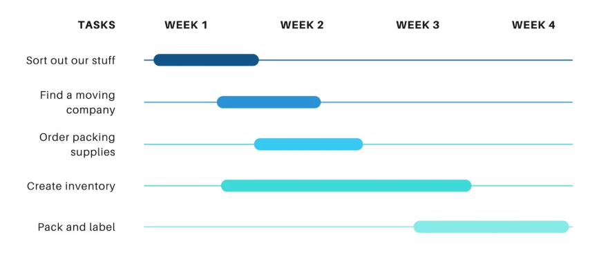
10. Product Launch Timeline (Gantt Chart) - Maps out competitors’ feature releases and updates. Key Elements:
- Timeframe (months/quarters)
- Bars representing different product milestones
Best Use Cases:
- Anticipating market trends
- Planning your own roadmap strategically
Example: A fintech startup tracks when PayPal and Stripe release new payment features to time its own updates.
These data visualization examples help businesses track, analyze, and outperform competitors by turning complex data into clear insights. Whether you’re in product development, marketing, or sales, the right charts can reveal hidden opportunities and threats in your industry.Which visualization will you try first?
Tools to Create Data Visualization Examples
No-Code Tools: Tableau, Power BI, Looker Studio
If you prefer drag-and-drop tools, these are your go-to options:
- Tableau: Best for dashboards and real-time data.
- Power BI: Great for internal reporting in large companies.
- Looker Studio: Works well with Google tools.
They work, but they often require setup and configuration. For quick results, especially if you’re not a data scientist, VisualGPT is better.
Code-Based Tools: Python Libraries (Matplotlib, Plotly)
If you or your team codes, these Python libraries are powerful:
- Matplotlib: Best for simple visuals.
- Plotly: Interactive and modern-looking charts.
But again, coding takes time. With VisualGPT, you get the same quality with none of the complexity.
AI Visual for Quick Data Visualization
VisualGPT is an AI visual tool t hat helps you generate visuals with zero design skills. You upload a file or paste in some text,even a link, and it gives you a ready-to-use visual. You can choose the type of chart, style, and even colors.
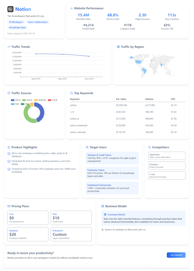
Need to extract competitive insights from massive web data and generate a comprehensive analysis report in 15 minutes? You can. VisualGPT helps you focus on decisions, not formatting.
Step-by-Step Tutorial: How to Use AI Visual for Competitor Analysis
Here’s how to use VisualGPT step by step:
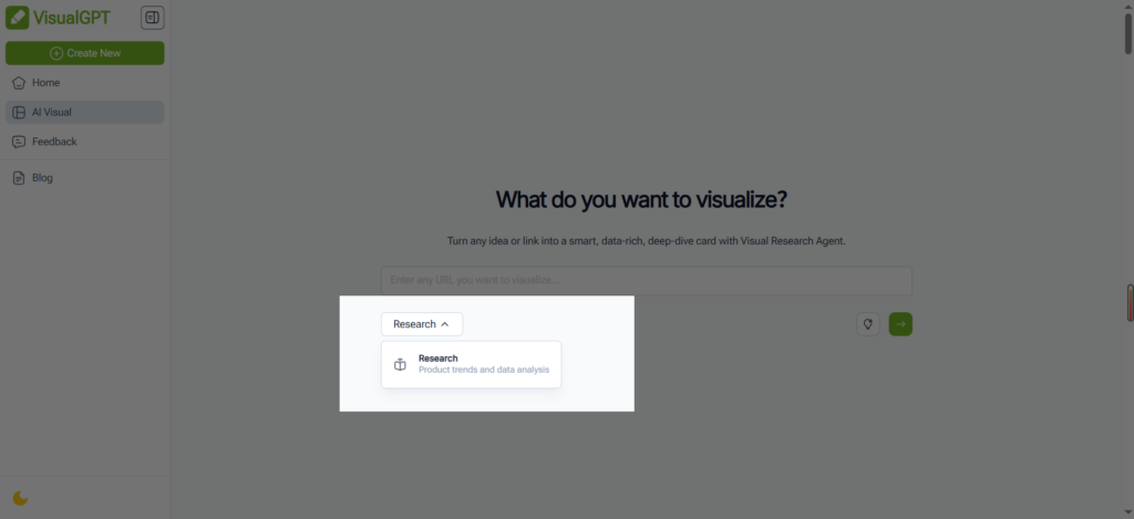
Step 1:Enter a competitor URL or type a topic Paste a product website link or enter a research topic to get started.
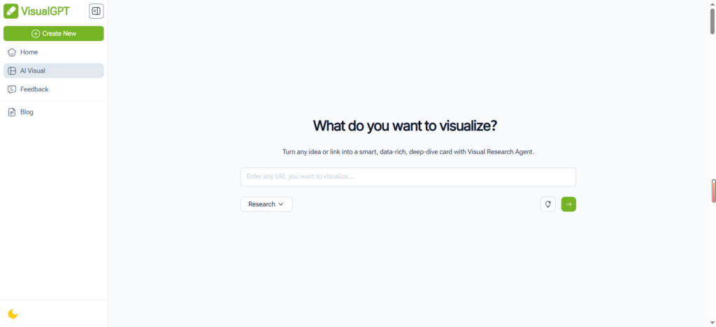
Step 2:Select "Research" mode Choose the Research option to run an in-depth competitor analysis.
Step 3:Let the AI Agent gather insights The system automatically searches and analyzes relevant competitor data.
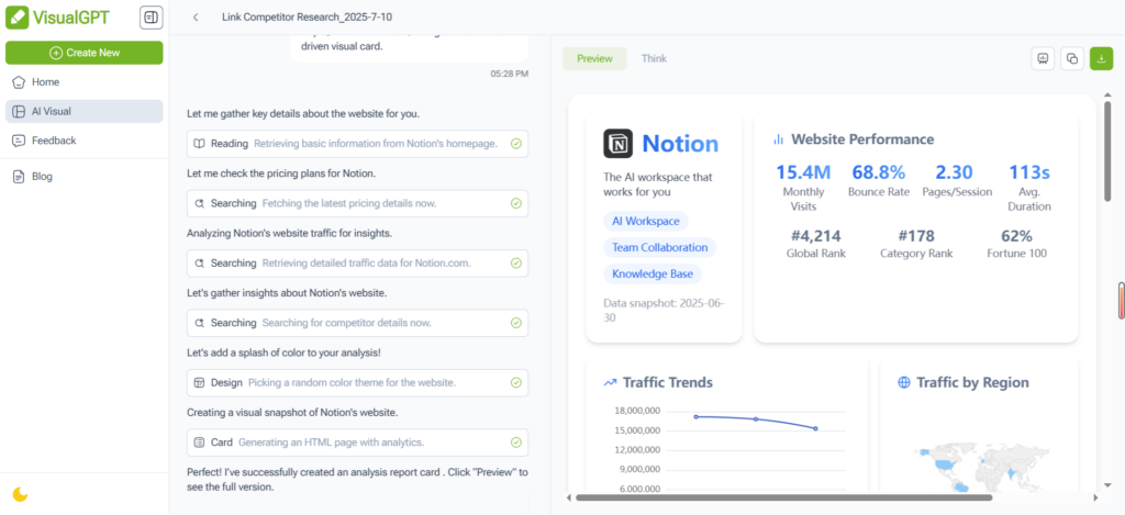
Step 4:View and share your visual report Review the AI-generated charts and insights, then download or share the report instantly.
Within minutes, you’ve turned data into a story.
Frequently Asked Questions About Data Visualization Examples
Q: Why is data visualization crucial for competitor analysis?
A: Data visualization transforms complex competitor data into clear, actionable insights. Instead of analyzing raw numbers, visual formats like market share pie charts and pricing trend graphs help you:
- Quickly identify market leaders
- Spot emerging trends
- Make data-driven decisions faster
- Present findings more effectively to stakeholders
Q: What tools can I use to create these visualizations?
A: Several options exist depending on your needs:
- VisualGPT (Free tier available)
- AI-powered chart generation
- No design skills required
- Pre-built competitor analysis templates
- Tableau/Google Data Studio (More advanced)
- Custom dashboard creation
- Real-time data connections
- Excel/Google Sheets (Basic charts)
Q: What essential competitor data should I visualize first?
A: Focus on these key areas:
- Market Position: Market share, revenue trends
- Product: Feature comparisons, release timelines
- Marketing: Social engagement, ad strategies
- Pricing: Historical pricing, discount patterns
- Customer Perception: Review sentiment, NPS scores
Q: How can I effectively compare multiple competitors?
A: These visualization types work best:
- Radar Charts: Compare 5+ competitors across multiple dimensions
- Small Multiples: Show the same metric for all competitors in mini charts
- Bubble Charts: Plot competitors across 3 dimensions (e.g., price, features, market share)
Q: What makes a truly effective competitor visualization?
A: The best visualizations share these traits:
- Focus: Each chart answers one specific question
- Context: Includes benchmarks or industry averages
- Actionability: Clearly shows where to improve
- Design: Uses color strategically to highlight insights
Pro Tip: Start simple. A well-executed single comparison chart often delivers more value than an overloaded dashboard.
Ready to visualize your competitor data? Pick one key metric and create your first chart today!
Final Thoughts: Turning Data Visualization Examples into Action
Don’t Just See the Data — Act on It
A visual is only helpful if it drives action. After creating your charts, make sure to ask: What story is this telling? What can I do next?
Visual Thinking = Strategic Thinking
When you use data visualization examples, you train yourself to see patterns. You spot what competitors are doing well—and what they’re missing. That’s a big win.
Ready to Build Your Own? Start with These Templates
If you’re not sure where to begin, VisualGPT offers pre-built templates for all the examples in this blog. Head to AI visual and start turning data into action today.