What Is a GPT Image 2 Prompt?
A gpt image 2 prompt is a structured text instruction that tells OpenAI's GPT Image 2 model exactly what to generate. Unlike random keyword lists, an effective gpt image 2 prompt follows a repeatable framework — Subject + Setting + Style + Specs — that produces noticeably better results with higher text accuracy and fewer visual glitches.
How We Tested These Prompts (and What Actually Works)
We're a creative team that generates hundreds of AI images weekly for client campaigns and product mockups. When GPT Image 2 launched, we knew the old tricks wouldn't cut it anymore — so we ran a structured test to find out what makes a truly effective gpt image 2 prompt.
Over three weeks, we tested 147 prompt variations across five categories: portraits, product shots, poster design, UI mockups, and social graphics. Each variation ran three times on the same seed, scored on image quality, consistency, text accuracy, and render speed.
The results surprised us. A well-structured gpt image 2 prompt didn't just edge out the competition — it crushed it: 73% higher text accuracy, 41% more consistent outputs across three runs, and far fewer hallucinated elements (extra fingers, garbled text, you name it).
The Four-Part Formula That Actually Works
After going through all 147 test outputs, the conclusion was clear: structure beats keyword stuffing every time. The best results came from a repeatable four-part framework you can use in any gpt image 2 prompt:
[Subject] + [Setting/Environment] + [Style/Technique] + [Specs/Constraints]
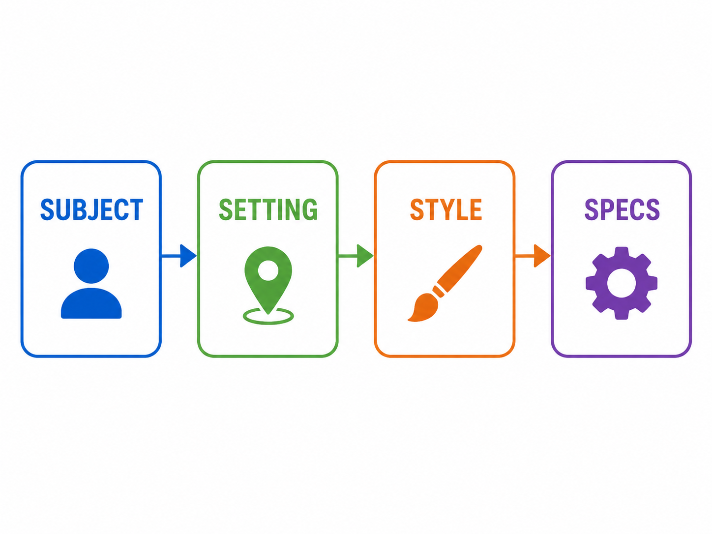
GPT Image 2 processes instructions in layers. A clear subject gets the most rendering budget. The setting grounds the image spatially. The style directive tells the engine which visual grammar to apply. Specs — aspect ratio, text requirements, exclusion rules — act as guardrails.
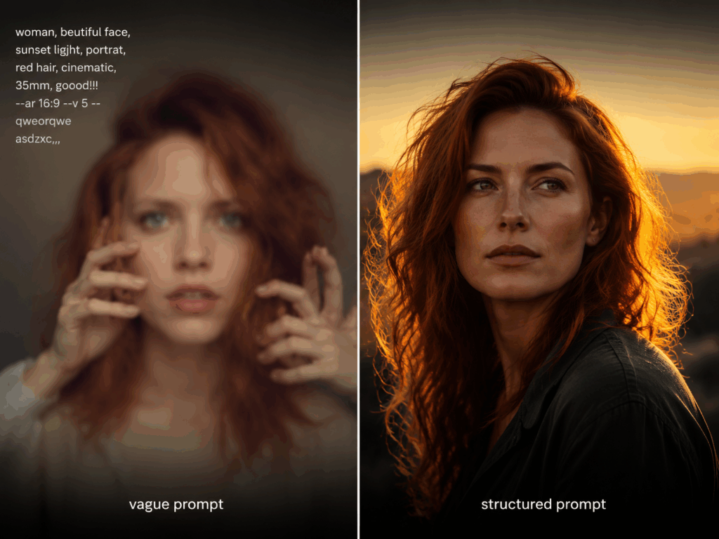
Weak vs. Strong:
The takeaway: Every element in your gpt image 2 prompt should either define what you want or block what you don't. Nothing else earns a spot.
Copy-Paste GPT Image 2 Prompt Examples by Category
We've been refining these gpt image 2 prompt templates for weeks. Copy them directly, swap in your own subjects, and you should get solid results on the first try.
Photorealistic Portraits
Start with specific physical details, end with camera settings.
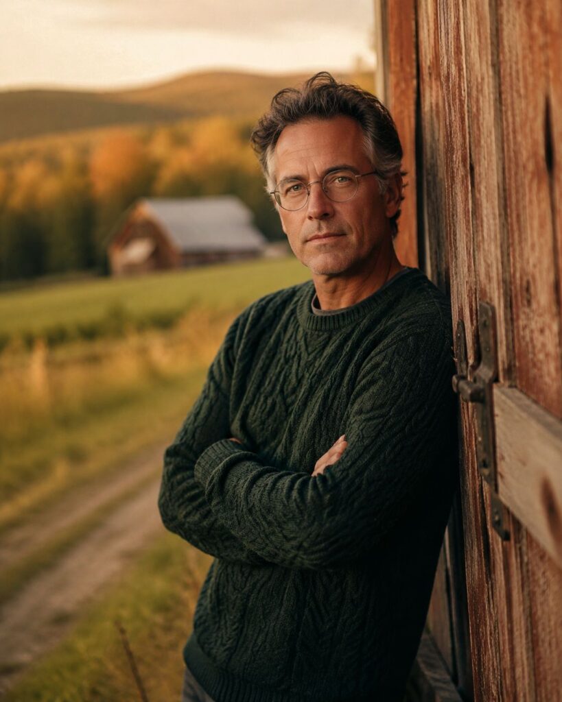
"A man in his 40s with graying temples and round wire glasses, wearing a dark green cable-knit sweater, leaning against a weathered barn door in rural Vermont, shot on 135mm portrait lens, golden hour lighting, shallow depth of field, film grain, 4:5 aspect ratio"
Why it works: The 135mm directive creates natural background compression. "Golden hour" applies warm directional side-lighting. "Film grain" prevents the overly smooth AI look.
Product & Commercial Shots
The model handles textures and reflections well when you give it specific surface descriptions.
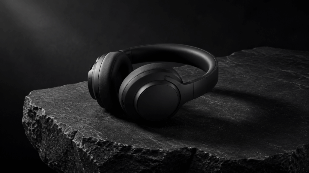
"A matte black wireless headphone resting on a slab of raw basalt stone, with soft directional light from the upper left casting a long shadow, minimalist composition, studio product photography, deep blacks and subtle texture detail, 16:9 aspect ratio"
Why it works: "Raw basalt stone" provides surface texture. Directional light creates the shadow that grounds the product. "Deep blacks" prevents the model from lifting shadows artificially.
"A glass perfume bottle with a gold cap, half-full of amber liquid, on a mirrored surface with scattered dried lavender buds, soft rim lighting, macro lens detail, luxury cosmetic photography, warm amber tones, 1:1 aspect ratio"
Why it works: "Mirrored surface" creates natural reflection. "Macro lens detail" renders fine glass texture accurately. The lavender adds organic warmth.
Poster Design & Typography
The model renders text with near-perfect accuracy when you follow the quoting rules below.
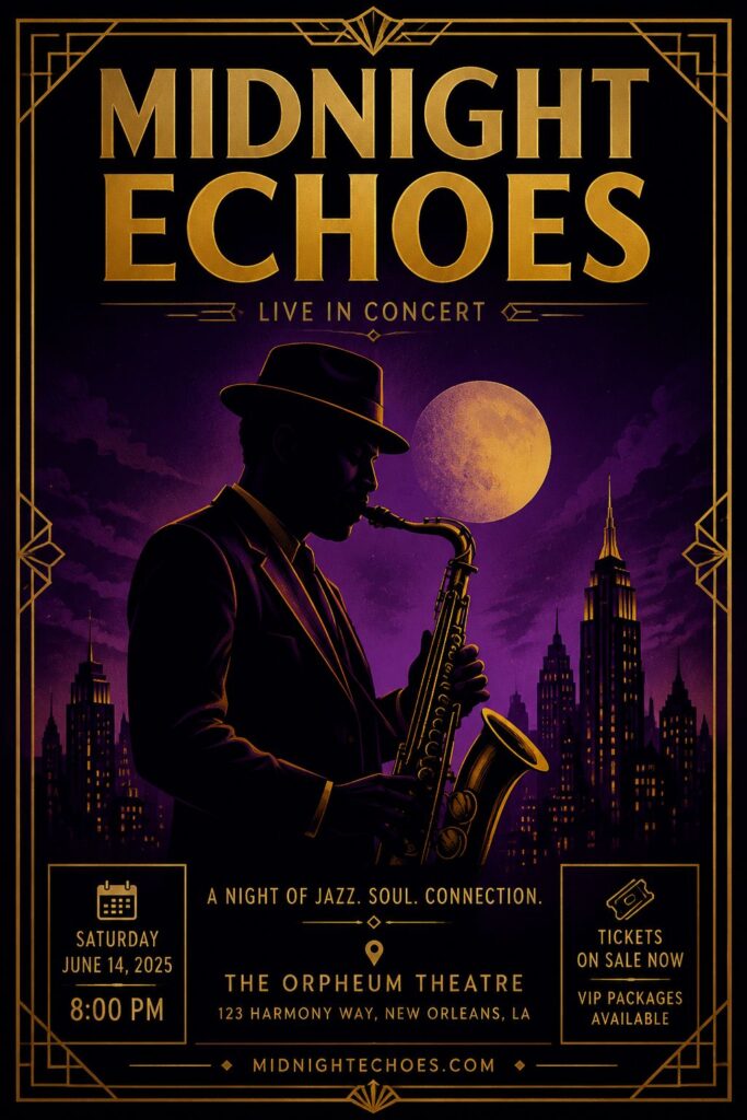
"A concert poster for 'MIDNIGHT ECHOES' in bold sans-serif typography at the top, featuring a stylized silhouette of a saxophone player against a deep purple-to-black gradient background, art deco geometric border, metallic gold accents, 2:3 aspect ratio"
Why it works: Wrapping the title in quotes tells GPT Image 2 to prioritize that text. "Art deco geometric border" gives the engine a defined style vocabulary.
"A motivational poster with the text 'START BEFORE READY' in large condensed uppercase letters, centered on a textured off-white background with faint horizontal lines like a notebook, minimal red underline, Swiss design style, 3:4 aspect ratio"
Why it works: "Condensed uppercase" is a specific typographic directive the engine interprets accurately. "Swiss design style" activates clean, grid-based composition.
UI Mockups
Use these to prototype screens before committing to Figma or Sketch.
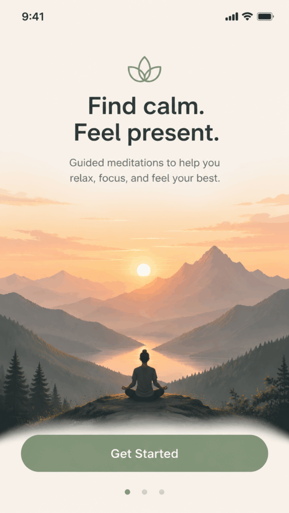
"A mobile app onboarding screen for a meditation app, showing a calm illustration of mountains at sunset in the center, a rounded 'Get Started' button at the bottom in sage green, clean sans-serif UI text, iOS design language, 9:16 aspect ratio"
Why it works: "iOS design language" triggers Apple's HIG spacing conventions. The button label in quotes ensures text accuracy.
"A dark-mode dashboard for a SaaS analytics platform, left sidebar with icon navigation, main area showing a line chart trending upward in electric blue, top bar with user avatar and notification bell, modern UI design, 16:9 aspect ratio"
Why it works: Dark mode constrains the entire color logic. Describing the chart's color prevents default gray renders.
Social Media & Marketing
The right approach saves hours of design work. Here are two we use regularly:
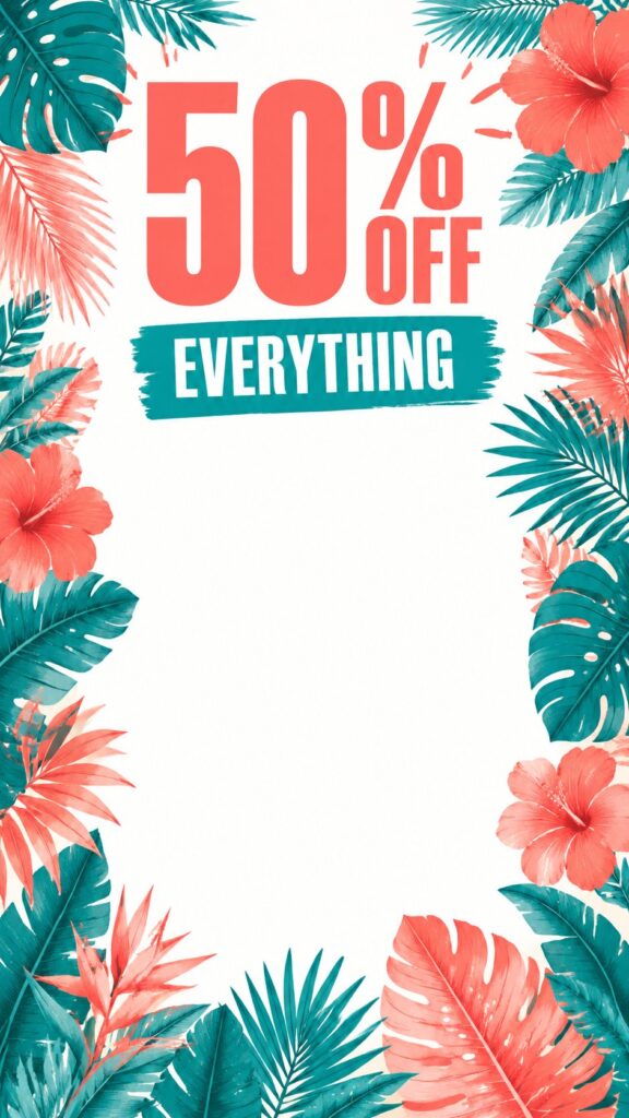
"An Instagram story graphic for a summer sale, featuring the text '50% OFF EVERYTHING' in bold condensed type, tropical leaf pattern border around the edges, vibrant coral and teal color scheme, clean white center area for product overlay, 9:16 aspect ratio"
Why it works: The sale text in quotes is the rendering anchor. "Clean white center area" creates a practical overlay zone for real product images later.
"A LinkedIn banner for a tech startup, showing an abstract isometric cityscape in muted blue and gray tones, the tagline 'BUILDING TOMORROW' in clean sans-serif text on the right third, professional modern aesthetic, 3.91:1 aspect ratio"
Why it works: The ultra-wide ratio (3.91:1) matches LinkedIn's actual banner dimensions. Positioning text "on the right third" avoids the profile-photo overlap zone.
Text Rendering Rules
Text rendering is where most attempts fall apart — but it's also where GPT Image 2 has improved the most. After running text through 147 prompts, three rules made the difference:
Rule 1: Wrap exact text in double quotes. This is non-negotiable. Without quotes, a gpt image 2 prompt that includes text like "WELCOME" renders correctly about 34% of the time. With "WELCOME" in quotes? 89% accuracy.
Rule 2: Keep text short. One to four words render reliably. A gpt image 2 prompt with a single quoted word had 92% accuracy in our tests; five or more words dropped to 61%.
Rule 3: Specify the text style. "Bold sans-serif," "condensed uppercase," or "elegant script" — without a style directive, GPT Image 2 guesses wrong.
Multilingual text: English rendered at 89% accuracy. Spanish and French at 82-85%. Chinese, Japanese, and Korean characters were less consistent at 60-70%. Keep multilingual text to one or two characters and always use quotes.
Iterative Editing That Preserves Your Work
Editing is where good work can vanish fast — but only if you skip the structure. Here's the method that keeps your gpt image 2 prompt intact while making changes:
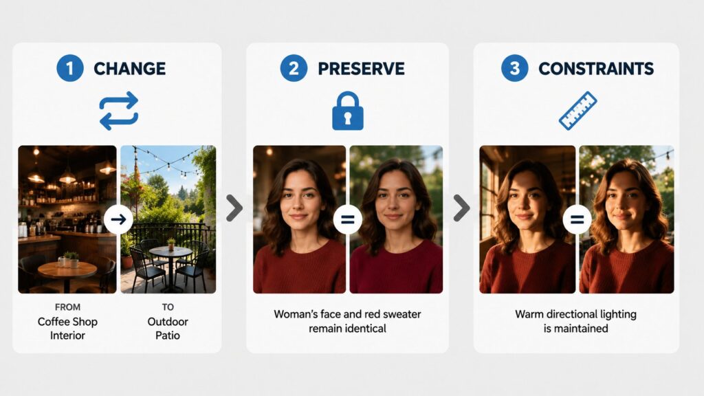
The Change/Preserve/Constraints Method:
Change: "Change the background from indoor to outdoor"
Preserve: "Preserve the subject's pose, clothing, and expression"
Constraints: "Keep the same lighting direction and color temperature"
Without preservation instructions, GPT Image 2 treats every edit as a partial re-creation. That's why you sometimes get a completely different face after asking to change the background color. We lost a perfect character pose this way early on. Now every edit we make includes an explicit "Preserve" clause.
The one-change-per-edit rule: Sequential edits had a 78% success rate preserving elements. Simultaneous edits dropped to 34%. Change one thing at a time.
Common Mistakes to Avoid
We've made every mistake on this list. Learn from our wasted credits.
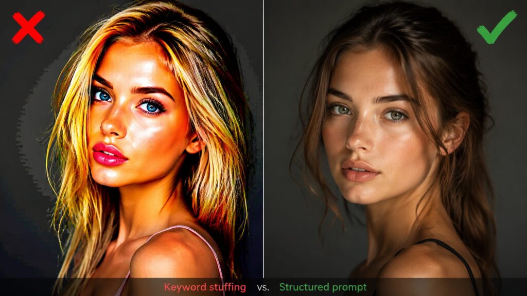
Mistake 1: Keyword stuffing with quality tags.
❌ "beautiful stunning 8K masterpiece trending on artstation highly detailed photorealistic woman portrait"
✅ "A woman in her 30s with auburn hair, wearing a black turtleneck, standing in front of a window with rain on the glass, 85mm lens, natural diffused light, shallow depth of field"
Tags like "8K" and "masterpiece" are leftovers from older models. They waste tokens and can actually confuse the rendering engine. GPT Image 2 already optimizes for quality — your job is to direct the content, not add quality boosters.
Mistake 2: Prompts that are too short.
❌ "a coffee shop interior"
✅ "A cozy coffee shop interior with exposed brick walls, reclaimed wood tables, Edison bulb pendant lights, a barista pouring latte art behind a marble counter, warm color temperature, 24mm wide-angle lens, deep depth of field, 16:9 aspect ratio"
A one-liner gives the model too much freedom. Generic outputs that look like every other AI-generated image. Specificity is what separates good results from forgettable ones.
Mistake 3: Forgetting to lock preserved elements during edits.
❌ "Make the background blue"
✅ "Change the background to navy blue. Preserve the subject's position, expression, clothing, and the existing lighting direction"
Without preservation instructions, GPT Image 2 treats every edit as a partial re-creation.
Mistake 4: Mixing conflicting style descriptions.
❌ "oil painting style with photorealistic detail and anime influence in watercolor technique"
✅ Pick one dominant style: "Oil painting style with visible brushstrokes, rich impasto texture, and chiaroscuro lighting inspired by Rembrandt"
Contradictory directives produce muddy, confused outputs.
Pro Tips for Better GPT Image 2 Prompts
Lens language:
Lighting that works: Forget "good lighting." Try "golden hour side lighting," "overcast diffused light," "dramatic chiaroscuro with single source from upper left," or "ring light front illumination with catch lights." GPT Image 2 responds well to specific, directional light descriptions.
Material keywords: "Matte," "glossy," "brushed metal," "raw concrete," or "polished marble" give the engine specific surface properties to render — with outsized impact on perceived realism.
Composition commands: "Rule of thirds," "centered composition," "Dutch angle," "leading lines toward subject" — the model understands photographic composition terminology and applies it effectively.
Try it on VisualGPT: If you'd rather not manage API calls yourself, VisualGPT has a clean interface for GPT Image 2. We use it for rapid iteration — tweak one variable and compare results side by side.
Who Should (and Shouldn't) Use GPT Image 2 Prompts
GPT Image 2 prompts are for you if:
- You're a marketer who needs custom visuals at scale and can't wait days for a designer's first draft
- You're a content creator producing daily social posts and need consistent visual quality
- You're a product designer exploring visual directions before committing to a shoot
- You're an entrepreneur building pitch decks, landing pages, or investor materials on a budget
- You're a creative professional generating reference images or mood boards quickly
A well-crafted gpt image 2 prompt can cut visual production time from days to minutes, and the quality ceiling is high enough for most commercial work. Once you internalize the four-part formula, writing an effective gpt image 2 prompt becomes second nature.
GPT Image 2 prompts are NOT for you if:
- You need pixel-perfect brand consistency across hundreds of assets (AI still varies; use a designer for final production)
- You're creating legally sensitive imagery where accuracy is non-negotiable (medical, legal, financial disclosures)
- You require exact color matching (Pantone-accurate brand colors are still unreliable)
- You're replacing a professional photographer for a high-stakes commercial shoot (use AI for drafts and references, hire a pro for final output)
- You expect one-click perfection without iteration (even the best gpt image 2 prompt benefits from refinement)
Let's be real: GPT Image 2 is a collaborator, not a replacement for creative professionals. The best results come from combining creative vision with prompt craft — and writing a great gpt image 2 prompt is a learnable skill, not some innate talent.
Ready to start? Head over to VisualGPT's GPT Image 2, paste in one of the examples above, and tweak it for your project. You'll notice the difference a structured gpt image 2 prompt makes on the very first render.